
Where is Indonesia in the Course of the Covid-19 Epidemic? The Limitations of Government-Published Data Make it Harder to Tell
by indonotes

(Source: https://covid19.go.id/p/berita/infografis-covid-19-10-mei-2020.)
An optimistic view of the state of the Covid-19 epidemic in Indonesia was given by government Minister Muhadjir Effendy on Friday. According to the Jakarta Post he said: ‘We’re on the right track. There is a decreasing trend of cases, though not dramatically’.
However, it is hard to share his confidence based on the government has published. It is not that the government is not making any data available. A government website provides basic information (for example, 14,032 confirmed positive cases and 973 deaths at the time of writing). They have even been producing snazzy infographics (see above).
The question is, how far can we rely on the data the government is producing?
One difficulty is under reporting and limited testing. The below chart drawing on data from the Oxford-based Our World in Data site gives an indication of the low level of testing currently underway in Indonesia. It shows the number of polymerase chain reaction (PCR) tests being carried out daily across a selection of countries.

Although there are caveats to the statistics the overall picture is clear. It is true that countries do compile the figures differently. It is also true that Indonesia has carried out ‘rapid testing’ using tests that detect antibodies to Covid-19. However, accounting for different methods of data collection would not change the story that Indonesia’s testing rates are low. And the ‘rapid tests’ are not a substitute for PCR testing.
There is also reason to believe that government statistics on Covid-19 related deaths are greatly under-estimated, and could be as much as 10 times higher than reported by the Indonesian Government (according to some very rough calculations below). Data on burials in Jakarta indicate a sharp increase in the number of deaths compared to the same time in previous years. The pattern is clear in the below chart produced by the Jakarta government (available via an Indonesian newspaper):
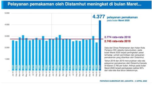
Jakarta government statistics list 4,422 burials in the Greater Jakarta area in March and 4,377 in April (the March figure in the above chart was subsequently updated). On this basis Reuters estimated over 2,500 ‘excess deaths’ across March and April in Jakarta, although the Indonesian government reported only 375 deaths in Jakarta up to May 2nd. If anything the Reuters estimate is conservative. Using the above chart to get an average 2,757 deaths per month across 2018-19 I get an excess of 3,282 burials across March-April 2020. There are some reasons for thinking the 3,282 may be on the high side. The average for March and April was a bit higher in 2018-19 than the overall monthly average, so it is possible that the ‘excess’ may be a bit lower than my calculation suggests. There may also be other reasons for some of the excess deaths (for example people with other illnesses avoiding hospitals out of fear of Covid-19). On the other hand, the Economist says that the burials statistics only reflect about 75% of deaths in Jakarta. That would imply a higher number of excess deaths than my calculation. It should also be noted that the Reuters report mentioned above also found that under-reporting of Covid-19 deaths was occurring in other regions too.
Moreover, under-reporting is not the only difficulty. There have also been criticisms of the way in which data has been reported. Specifically, a group of researchers (Iqbal Elyazar, Karina Dian Lestari, Lenny Lia Ekawati and Rosa Nora Lina) this week wrote an article for The Conversation under the title ‘Indonesia does not yet have a Covid-19 epidemic curve: we must be careful about the government claims that new cases have declined’. Unfortunately, the article is only available in Indonesian, but I quote the main points below:
‘A standard visualisation tool… is an epidemiological curve (epidemic curve). This curve is normally used to explain the path of the pandemic, determine the source and time of transmission, determine the epidemic’s peak, estimate the end of the pandemic, and evaluate the effectiveness of control measures.
The primary problem is that… Indonesia has not yet presented a Covid-19 epidemic curve in accordance with standards of epidemiological science…
In general, the epidemic curve visualises the number of new cases over time. The Y axis (vertical) shows the number of new cases, whilst the X axis (horizontal) identifies the time units of analysis connected to the number of new cases. For example, the dates people were infected, dates people began showing symptoms and dates people were tested…
… the Indonesian government has only presented the curve of daily Covid-19 cases. On the curve the Y axis shows the number of additional confirmed cases, whilst the X axis is the date the cases were publicly reported….
Before reading an epidemic curve, there are three things that need to be considered…
[1.] the size of the number of people tested determines our degree of confidence with regard to the epidemic curve…
[2] the X axis of the epidemic curve in relation to the time units of analysis. Ideally, for Covid-19, the epidemic curve would use the date that a person becomes infected…
[3] Third, the epidemic curve has characteristics specific to a particular location…
To control the spead of Covid-19 in Indonesia, the government needs to do the following:
First, the Indonesian government needs to openly publish the epidemic curve in line with the standards of epidemiological science for every province and district/city…
Second, the government needs to openly and transparently present the data for the number of PCR (polymerase chain reaction) tests and the length of time of tests (lamanya waktu pemeriksaan) for each province and district/city…
Third… the government needs to use this standard epidemic curve as one of the ways of evaluating the implementation of control measures for Covid-19….
We all want this pandemic to end quickly. Good news supported by methods of measurement that are valid, accurate and trusted, will give hope. It us that which is now possibly absent in Indonesia.
Human Rights Watch has warned that there has been ‘little transparency’ in the government’s approach and has cited cases of ‘netizens prosecuted for criticizing officials’.
Let’s hope that pressure from researchers and civil society will result in the government improving the data it provides, increases transparency, and provides a firmer foundation for tackling the pandemic.

A very interesting article! Thank you for taking the time to write it!